Cut Above the Rest: My Top 10 Paper Projects of 2025
(Plus the Behind-the-Scenes Stories That Made Them Special!)
Every year, I dive into countless papercraft ideas, cutting, folding, and assembling to bring paper to life. This year was no different, but some projects stood out more than others. Today, I’m sharing my top 10 paper projects of 2025 that I felt were a cut above the rest, along with the reasons they captured my heart and a few behind-the-scenes stories that made their creation memorable. Whether you’re a seasoned crafter or just love paper art, I hope you enjoy counting down with me to my favorite project of the year! If any of these projects inspire you, please don't hesitate to create your own version and tag me on Instagram (@artemismade1)!
Before we jump into the countdown, let's first start with some honorable mentions in no particular order. There were so many projects I loved this year (and not gonna lie, quite a few I, um, didn't... 😂), but my ultimate choices for the list resulted from how much I grew as a crafter with each one. That said, these few do deserve a shoutout for their own influence on my development!

First real foray into watercoloring and loved the effect! Features The Rabbit Hole Designs' Daffodil 
Crafted this one LIVE & on the fly with Craft Roulette Tailgate! 
This one is personal because it was a gift to daddy from our corgi 
1st time creating folds in fabric! Loved this one! 
1st time masking and stacking elements + love the rainbow & message! 
1st time using two color tones on florals, made it to the front page of the product!
Please note--This post contains some (but not all) affiliate links that can be used at no extra cost to you. Why should you use them? Sure, getting a teeny kickback for a cup of coffee once in a while is nice, and I so appreciate the support, but that's truly not what it's about for me. It's about letting these companies know that the marketing dollars they spent on me were not wasted! They track affiliate sales so they know where their sales are generated and that I not only use--but LOVE--their products, and considering what a tough industry this is for these incredible companies, any positive feedback they get is a great thing! And...full disclosure...it also makes me feel all warm & fuzzy to know you like my projects. insert cheesy grin here 😉
Ok, and now on to the main event! Let's count down the Top 10 2025 superstars (at least in my opinion! 😁):
10. The One That Made Me LOL
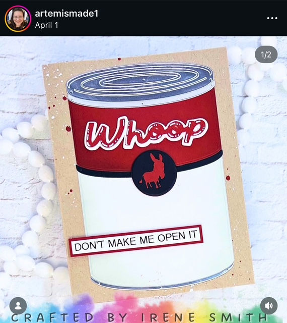
As many of you know, I love a good pun and an even better laugh! Sometimes that means getting extra creative and making my own sentiments to bring my goofy ideas to life.
For this seriously silly card, I fired up my Cricut to cut a bold “Whoop” with a shadow layer and a cheeky donkey medallion in red and black. Then I grabbed my label maker for the perfect sub-sentiment. Personalizing cards like this gives me total creative freedom—no limits, just whatever pops into my head!
Is this the best card I’ve ever made? Probably not. But is it peak Irene—quirky, fun, and unapologetically me? 100% yes!
Products Used:
Concord & 9th Wheat & Silver Foil Cardstock
Sakura Gelly Roll Pen - 10 Point White
Dr. PH Martin's Bleed Proof White
9. The One I Made Live
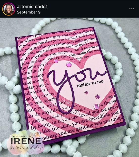
Card Chaos: Quarter-Hour Cards—my weekly live card challenge—has been one of the most unexpected (and exciting!) twists in my cardmaking journey. The craft community’s response? Overwhelmingly positive. The enthusiasm, the guests, the folks playing along—it blows my mind and makes me feel so grateful to be part of such a creative, supportive group!
Now, real talk: not every one of my 15-minute cards is a masterpiece (LOL, I own that!). They’re all special, but some…well, let’s just say they’re more “character-building” than “gallery-worthy.”
This one, though? Oh my word. Everything clicked—the colors, the layered “you,” the uplifting messages, even the perfectly open space. I loved this card so much it practically begged for a spot on this list! (Watch me make it live HERE!)
Products Used:
8. The One I Wish I Didn't Need
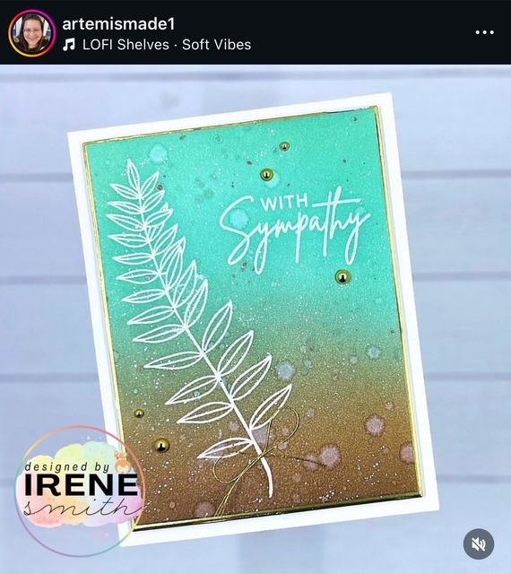
Sympathy cards are never easy to make—especially when the need is real. I truly wished this card didn’t have to exist, but I’m grateful its simplicity and elegance reflected what I felt: sorrow for a painful loss, yet gratitude for a life well-lived and a man deeply loved.
On the creative side, I took a chance blending just two colors—and was pleasantly surprised by the soft, seamless result. That gentle gradient felt perfect, especially knowing the family’s close connection to the beach. Sometimes, the smallest details carry the most meaning.
Products Used:
Concord & 9th Ink Pads - Sea Glass & Nutmeg
Stamp unknown but believe it to be Taylored Expressions
Gina K. Designs Master Layouts 01
7. The One That Defined My Coloring Style
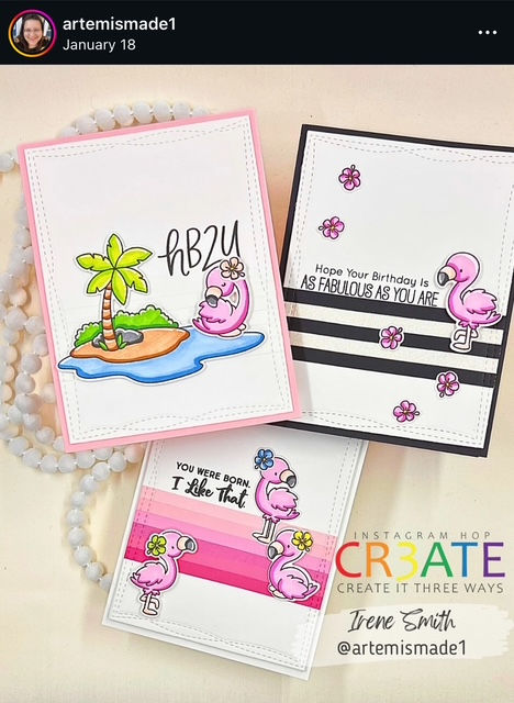
I’ve never thought of myself as an “artist.” I can’t just pull an image from my head and put it perfectly on paper. For me, it takes planning—color theory, composition, all the little details. And for the world of cardmaking, coloring is a big part of that. Sure, I can stay inside the lines (mostly), but creating depth with shadows, highlights, and contrast? That’s been a real challenge.
The good news? I’ve improved (see #3 below!) and discovered my own style, something I call high-contrast coloring. I use three colors for each area—base, shadow, and highlight—for quick but striking results. This trio of flamingo cards was the first time my coloring truly came to life. Their light pink base, bold one-color shadows, and crisp white highlights perfectly showcase the look I’ve been developing. And the best part? Others seem to love this simple yet impactful style too! (P.S. I know there are 3 cards here and not just 1, so it may look like I'm cheating a wee bit--but it's the collection itself that I think works so well! If I absolutely had to pick a favorite, though, I'd probably go with the pink stripe card...or the hb2u...umm...or the black and white?! This is so hard!! LOL)
Products Used:
(Note: I realize the MFT items are no longer available, but I am including them as you may locate them in destash groups or on a resale site.)
My Favorite Things Wonky Stitched Rectangle STAX Die Set
My Favorite Things Fabulous Flamingos Stamp & Die Set
My Favorite Things Birthday Messages Stamp Set
My Favorite Things Anything-but-Basic Birthday Wishes Stamp Set
Sakura Gelly Roll Pen - 10 Point White
6. The One I Get to Keep
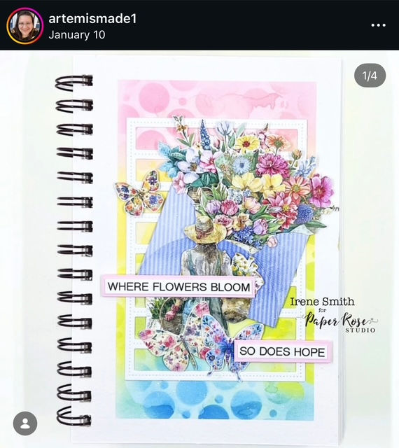
Most of what I share are handmade cards, but every now and then, I feel the pull to create something just for me. That’s where my art journal comes in—and this page was a big “first” in two ways.
First, it was the very first journal page I absolutely loved, the one where I could really see my progress in this art style. Second, it marked my debut as an official member of the Paper Rose Studio design team! I was overjoyed to be selected, and I think that joy shines through in the vibrant colors and expressive composition of this layout.
I’ve made plenty of pages since this one that I love just as much, but this one earned its spot in the Top 10 because it was the first—and that makes it extra special.
Products Used:
Strathmore Visual Watercolor Journal
Paper Rose Studio Flower Shoppe:
6x6 Paper Pad @ Scrapbook @ Paper Rose
Embossed Die Cuts @ Scrapbook @ Paper Rose
Cut Aparts @ Scrapbook @ Paper Rose
5. The One I Made On the Road
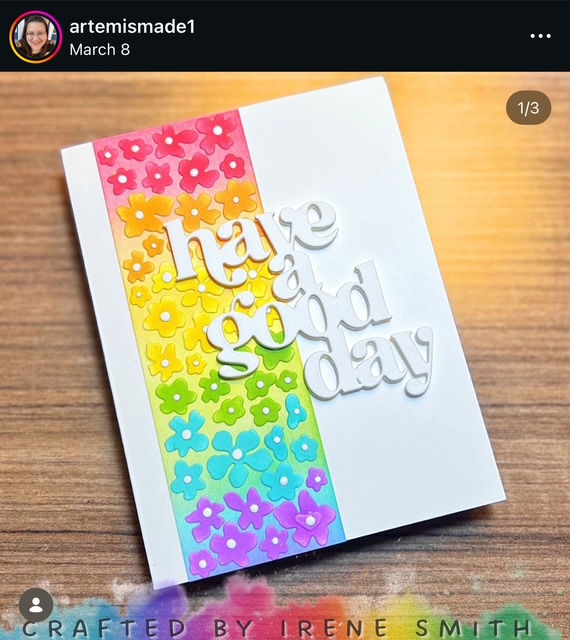
My crafty adventures don’t stop at the craft room—they take me to expo halls, classrooms, scrap stores, and even long car rides (which I secretly love!). That means I need a go-to kit for creativity on the move.
This card? Made in my hotel room while at the Stamp, Scrap, Art Tour in Rockford, IL. I had an Instagram hop deadline and zero time to prep. With just a rainbow of ink cubes, a cover die, and a sentiment die, I created one of my Top 10 favorite cards of the year. Bright, bold colors paired with delicate florals and crisp white space—pure joy!
Huge thanks to Michelle Lupton for inspiring this design as a CASE of her gorgeous work (click here to see the card that inspired mine)! Sometimes, limited supplies spark the best creativity!
Products Used:
4. The One I Can't Believe Is Mine
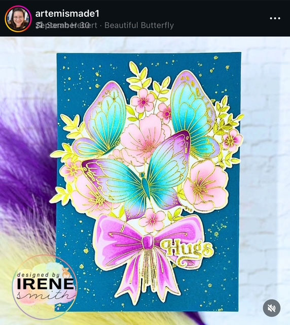
Have you ever made something and thought, Wait… that came from my brain and my hands?! Yeah—that was this card for me. The bold, coordinated colors mixed with delicate contrasts and those almost-lime yellow accents? Totally out of my comfort zone!
I don’t know what gave me the courage to try this color blend, but I do know one thing: I fell head over heels for Plumberry—that deep wingtip shade on the main butterfly—and I’ve wanted to use it on every card since!
It’s also special because it’s a 5x7, which I rarely make. But there was no way I was cutting down that focal point. Nope. Not happening. Normally, every card I make gets gifted or mailed out (eventually…lol), but this one? I think it’s staying on my wall for a while. 😉
Products Used:
Crafty Meraki Never Released Items (sorry! ☹️)
Altenew Antique Gold Crisp Embossing Powder
3. The One That Shows My Growth
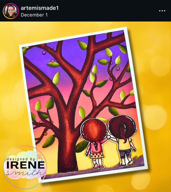
This card. Oh my goodness—I love it. If I didn’t make it myself, I’d never guess it started with a tree stencil. I wanted a sunset background, so I ink-blended over the stencil. Pretty colors, sure, but when I lifted it? That stark white tree had me stumped (hee hee, pun intended!).
Enter my alcohol markers. Instead of my usual high-contrast style (see #7 above), I went full-on traditional—layering shadows, depth, and highlights. My little characters? Still working on that hair game (it's so tough!). But that tree? WOW. The texture, the bounced light—I’m honestly so incredibly proud of it.
I feel weird saying that because I like to stay humble, but I can’t believe I colored something in this style and truly loved it! Loved it so much, in fact, that I skipped the sentiment. Some cards speak for themselves, and this one absolutely does. I can't wait to see how much my coloring improves in the coming year!
Products Used:
A Colorful Life Designs Tree Stencil - use code IRENEFAN10 for 10% off your order!
Sakura Gelly Roll Pen - 10 Point White
2. The One I Made by Accident
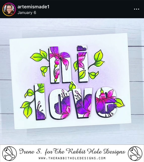
My favorite way to craft? Hands down—with friends. There’s just something electric about a room full of creative souls, bouncing ideas and energy off each other. This card was born during one of those sessions with two of my best crafty buddies. We were stamping, coloring, chatting (and yes, binging Netflix because… priorities, lol), and I was loving the color blend on these gorgeous fuchsias, which in itself is saying something because again, alcohol marker coloring is not my strong suit.
Then came die-cut time—and instant panic. I’d stamped everything way too close together. Options? Sacrifice a few blooms? Scrap the whole thing? Use it as a panel? Nope, nope, and nope. None of those worked. Then I spotted a letter die set on my desk and—lightbulb moment! What if I turned this into patterned paper letters?
And oh, did it work. I layered them with black cardstock for pop, added a soft purple ink-blended background, tucked in a few leaves, and ended up with a card I seriously considered putting at #1 on this list. This was truly a "trust the process" card. Sometimes, a little crafty chaos leads to pure magic!
Products Used:
The Rabbit Hole Designs Fabulous Fuchsias Stamp & Die @ The Rabbit Hole Designs @ Scrapbook
Wink of Stella Glitter Pen @ Scrapbook @ A Cherry On Top @ Amazon
AND FINALLY, DRUMROLL PLEASE...
1. The One That Stretched My Limits
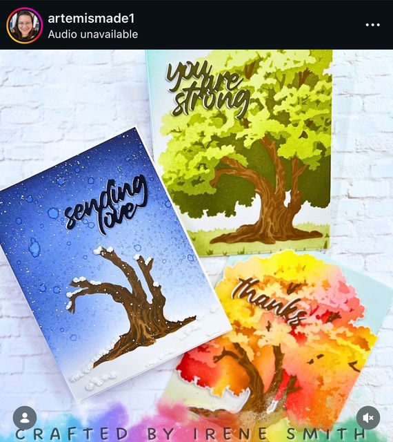
This trio of cards, much like my flamingo set, was created for the Create It 3 Ways Instagram Hop—and oh, how I love that hop! It’s such a creative playground because I get to zero in on one product, one technique, or one style and really stretch my imagination. Seeing these three cards together honestly moves me. They don’t just show the changing seasons—they show the evolution of me as a maker. Growth. Passion. Art. All in one frame.
Let’s break it down:
Card One: Fresh Beginnings
I started with the green tree and kept things simple. Ink up the layers, ground it nicely, and top it off with a positive affirmation. This card feels like my “hello world” moment in cardmaking—basic techniques, but full of heart.
This Springy tree card shows the beginning of my crafty journey in simple techniques and colorways. Adding the ground layer with tufts of grass helped ground the focal point.
Card Two: Autumn Glow
Here’s where I branched out (pun totally intended!). I dove into a luscious blend of reds, yellows, and my favorite—rich oranges. Then I added a little sparkle with gold spatter. This card feels like confidence blooming.
This Autumn card reflects me stepping beyond the basics and trying new techniques. The sparkle of the gold spatter here reminds me of sunlight peeking through the leaves.
Card Three: Winter Magic
Don’t let its simplicity fool you—this one stretched me the most! I started with a deep winter sky ink blend, misted water for that dreamy texture, and spattered extra drops of water and white paint to mimic snowfall. The tree got a progressively darker ink blend for depth. And then came the wild experiment: The Fluffy Stuff! (Seriously, whoever named this deserves a medal. Are they related to the genius behind “The Grey Stuff” at Beast’s castle? Because it’s equally delightful!) Once heated, this product puffed up like real snow, piling on branches and blanketing the ground. Pure magic.
To achieve this background, ink blend from the top down and fade it out for a white ground. Just look at the dimension & texture of The Fluffy Stuff! WOW!
Are there flaws in these three creations? Sure. But what I see most is progress—and pride. This trio tells a story of seasons and skills, and I couldn’t be happier with how they turned out. And what's wild? I still see many more ways I can create with this stencil set! Let's see what I can come up with for 2026...
Products Used:
Final Thoughts
And that’s a wrap on my Top 10 favorite cards of 2025! This year reminded me that creativity isn’t a straight line—it’s full of twists, turns, and even a few splatters (literally!). Every setback taught me something valuable, and every success reinforced the power of positivity. Cardmaking isn’t just a hobby for me—it’s an art form that fuels my passion and keeps me grounded. If you’re on this journey too, remember: growth happens when you give yourself grace and keep experimenting. I’m so grateful for the lessons, the laughter, and the community that makes this craft even more special.
Looking ahead to 2026? I’m dreaming big—more consistent video tutorial releases, deeper dives into techniques, and plenty of bold experiments. I can’t wait to share what’s next and cheer you on in your own creative adventures. Here’s to another year of making, learning, and celebrating the beauty of handmade art—together!
Now grab some paper and craft something that really makes you smile--
HAPPY NEW YEAR!!!


Comments